NITHEESH
MENU
HemNxt
Stocking Made Simple

Project Overview
A traditional investment firm wanted to step into the digital world—but their legacy approach didn’t speak to modern users. We saw an opportunity to reimagine trading for Gen Z: less jargon, more clarity. The result? A lightweight, beginner-first stock app designed to make investing feel as familiar as scrolling your favorite feed.
My role
Product Designer
Collaboration
Design Lead & PM
Timeline
6 months

Problem Statement
Most trading platforms overwhelm first-time users with cluttered dashboards, heavy data, and zero hand-holding. This traditional investment firm wanted to do things differently. Instead of building for the pros, they aimed to create a space where beginners felt safe, guided, and in control from day one.
What needs to be solved?
Overwhelming UI led to high dropout among new users
Lack of guidance created fear and confusion in first trades
Most apps target pros, leaving beginners behind

User Profile
They were young, curious, and ready to invest but the moment they opened a trading app, it all felt too much. Cluttered dashboards, confusing terms, and no real help. What they needed wasn’t more features it was clarity, comfort, and a little guidance to take that first step with confidence.

First-Time Traders
For first-time users, the charts, jargon, and endless options felt overwhelming nothing seemed built for beginners.

The Mobile Minimalist
They expected everything to be intuitive, fast, and frictionless, a trading app that felt more like a friendly tool than a financial terminal.
Key Insights
To understand what beginners really needed, we ran user interviews, studied competing apps, and audited the onboarding flows of top trading platforms. Each method brought us closer to the gaps we wanted to fill.
The insights we gathered became the foundation for every decision we made going forward from
layouts to micro-interactions.
Minimalist Design Wins
Users preferred apps like Groww for their clean, focused design. It made them feel less anxious and more in control.
01
Simplicity Over Complexity
Too many trading apps felt built for pros. First-time users just wanted an easy, guided way to get started.
02
Visual Learning Preference
Gen Z leaned toward visuals over heavy text. Clear charts, friendly UI, and fewer steps made a big difference.
03
Calm in the Chaos
In a space known for noise, users wanted quiet clarity. A trading app that didn’t overwhelm—but invited.
04
Solution #1
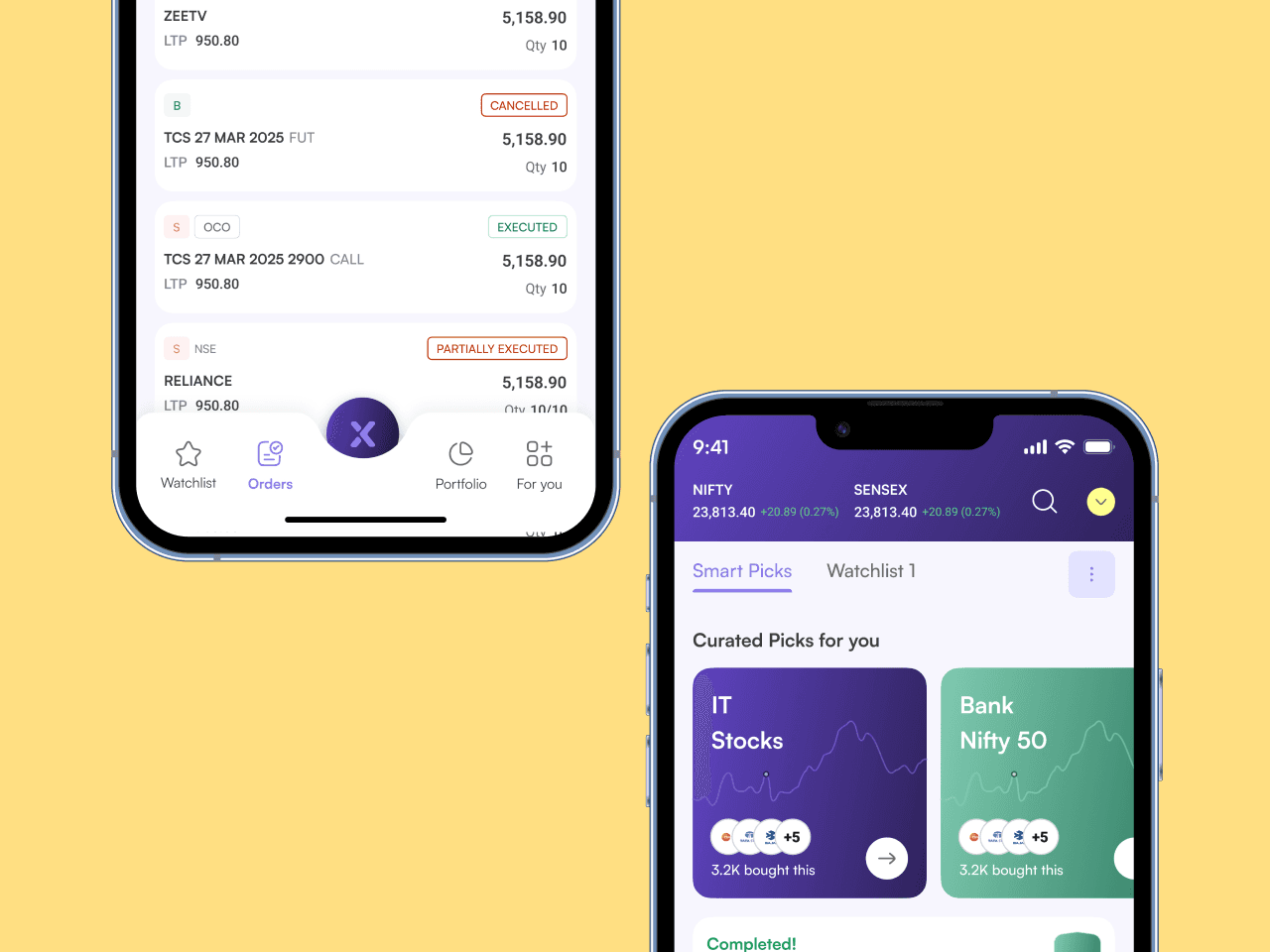
New users often froze at the sight of endless stock lists. So we introduced Firstpicks—a daily, behavior-based recommendation list backed by expert analysis. Grouped by sectors, it helped users explore based on interest and cut through the noise. It didn’t replace the market watch—it made it smarter.
#2
Most orderpads are overwhelming. We simplified ours with fewer fields, smart defaults, and helpful placeholders. A single layout worked for all order types—delivery, intraday, e-SIP—swipeable and easy to follow. It helped users place orders without friction or fear.
#3
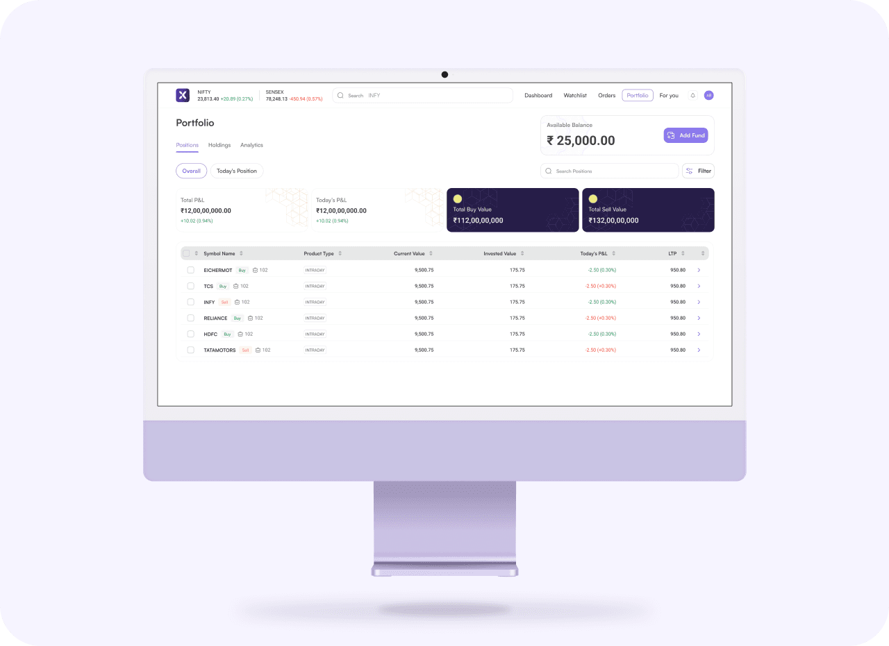
We built two dashboard modes: one for beginners, one for power users. Beginners saw trending stocks, curated picks, and real-time market overviews—all visual-first. Power users got the same, plus portfolio insights and allocation charts. It was simple, smart, and always in sync with user behavior.

Iterations
Nothing here was one-and-done. We explored multiple design directions for each flow—especially for the orderpad, which became our biggest challenge. We wanted it to feel minimal, but never incomplete. That meant rounds of feedback, weekly alignments with the PM and client, and constant discussions to get the balance right.
Design System
When the layouts got cleaner, our process did too. We built the design system from scratch every component, every variable. It became our second brain, speeding up design delivery and making dev handoff seamless. Anytime we needed to repeat an element, we just dropped it in no guesswork, no mess. It kept the experience consistent, and the team in sync

This project was more than just building a stock app, it was a deep dive into team collaboration, simplifying complexity, and putting users first. I got to work closely with developers, push my thinking around design systems, and sharpen my approach to research and prototyping.
If I did it all over again, I’d go even deeper into design tokens and pay closer attention to the tiniest details because that’s where real polish lives.